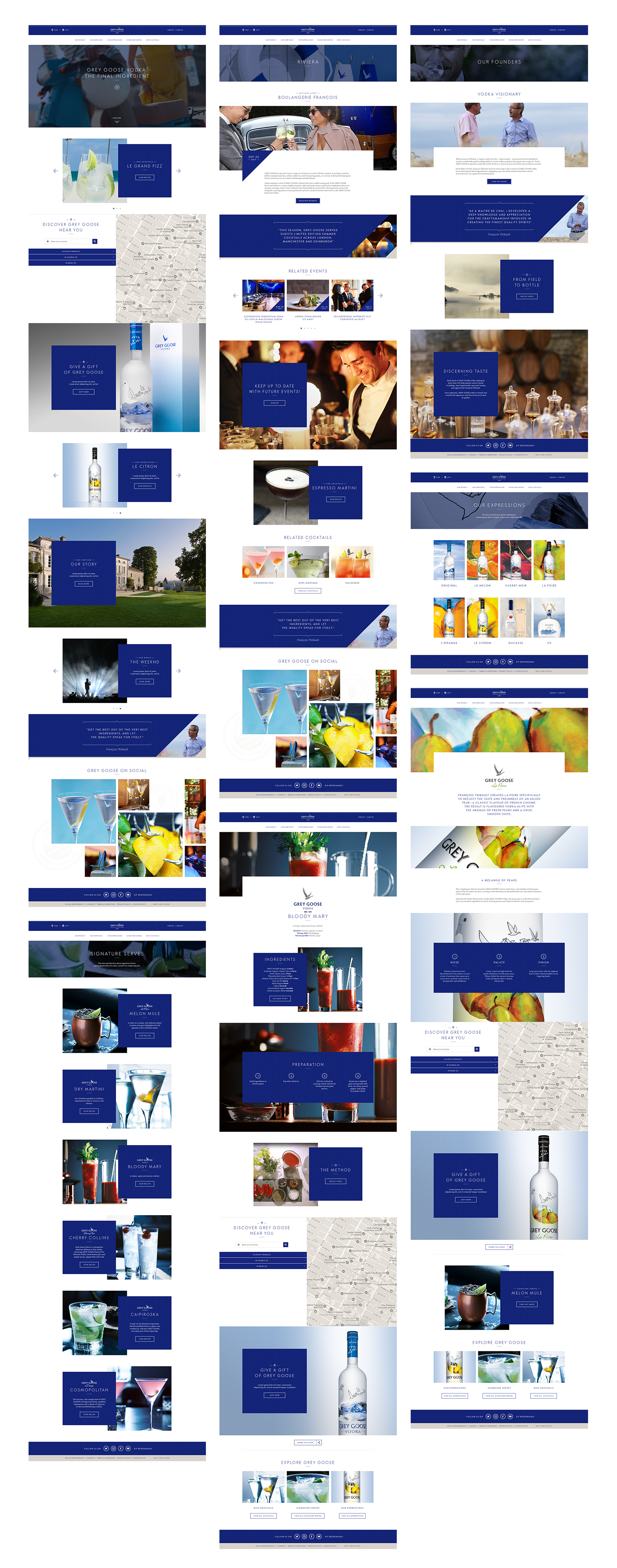
GREY GOOSE
CLIENT
Grey Goose
MY ROLE
Design
Art Direction
AGENCY
Proximity
YEAR
2017
Responsive website to evoke a premium feel and bring the brand to life.
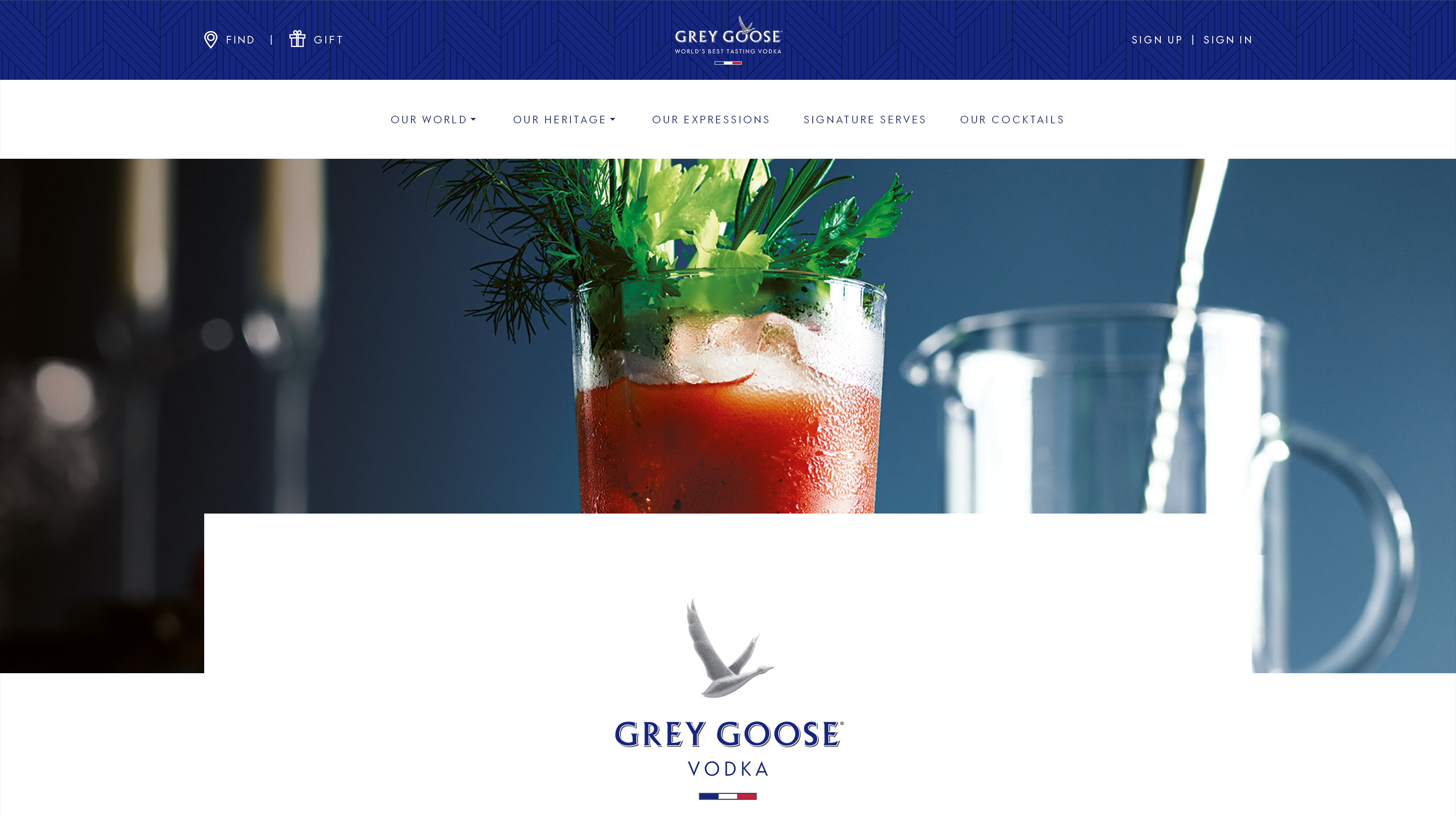
GREY GOOSE is a brand of vodka produced in France using 100% French ingredients. Part of the Bacardi Group, they required a website to function as an improved platform to highlight their products, heritage and showcase new campaigns.
Working alongside our Head of Design and the client, I led the design of the website, exploring ways to use the brand assets, and showcase GREY GOOSE' content and product offering.
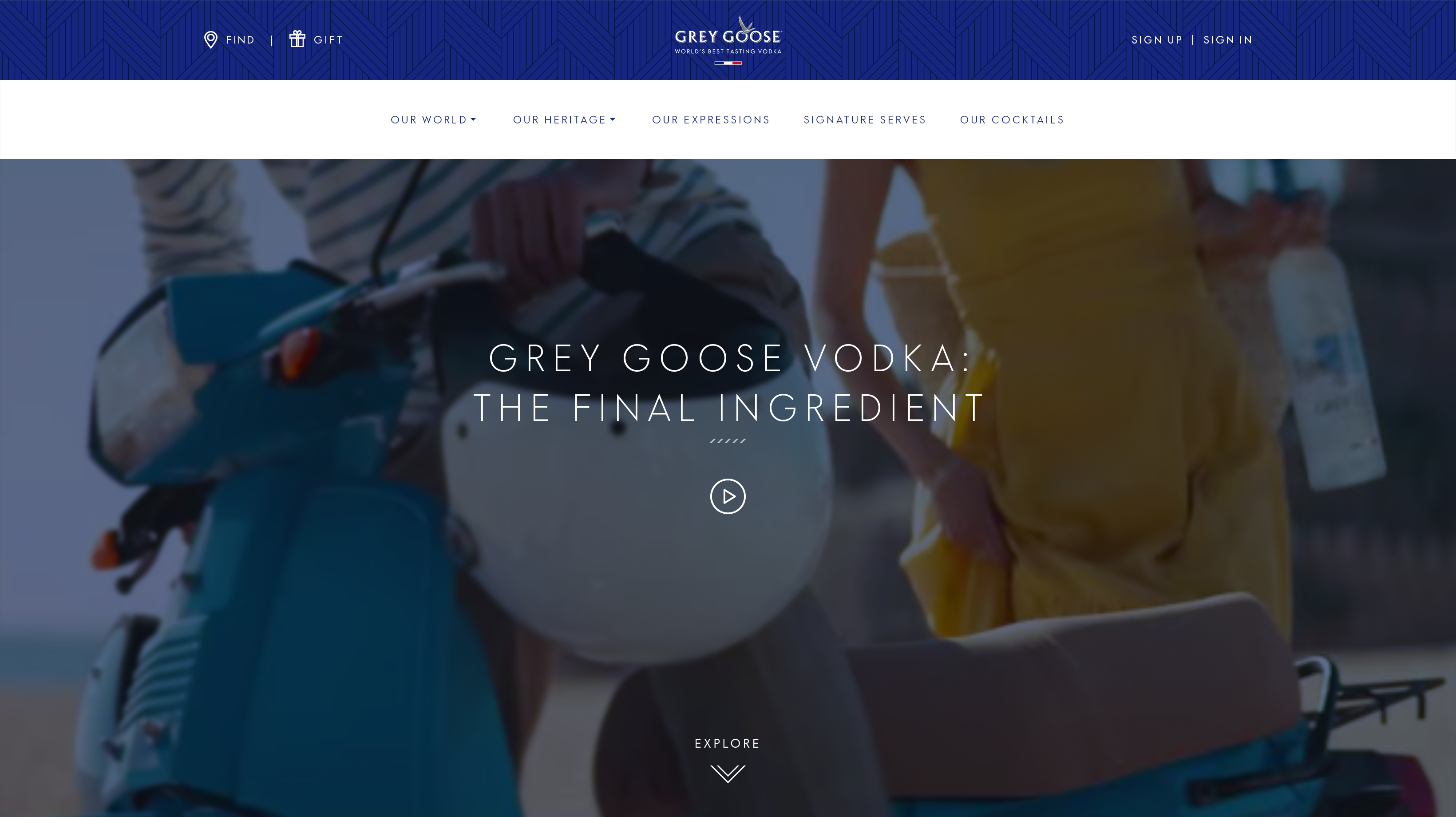
THE PROBLEM —
The legacy GREY GOOSE website didn't hero the brand's look and feel and consisted predominantly of full-bleed images. This resulted in a lack of visual hierarchy and made for a difficult user experience.
THE SOLUTION —
Create a visual language that emphasises Grey Goose as a premium brand and showcases the content and product offering.
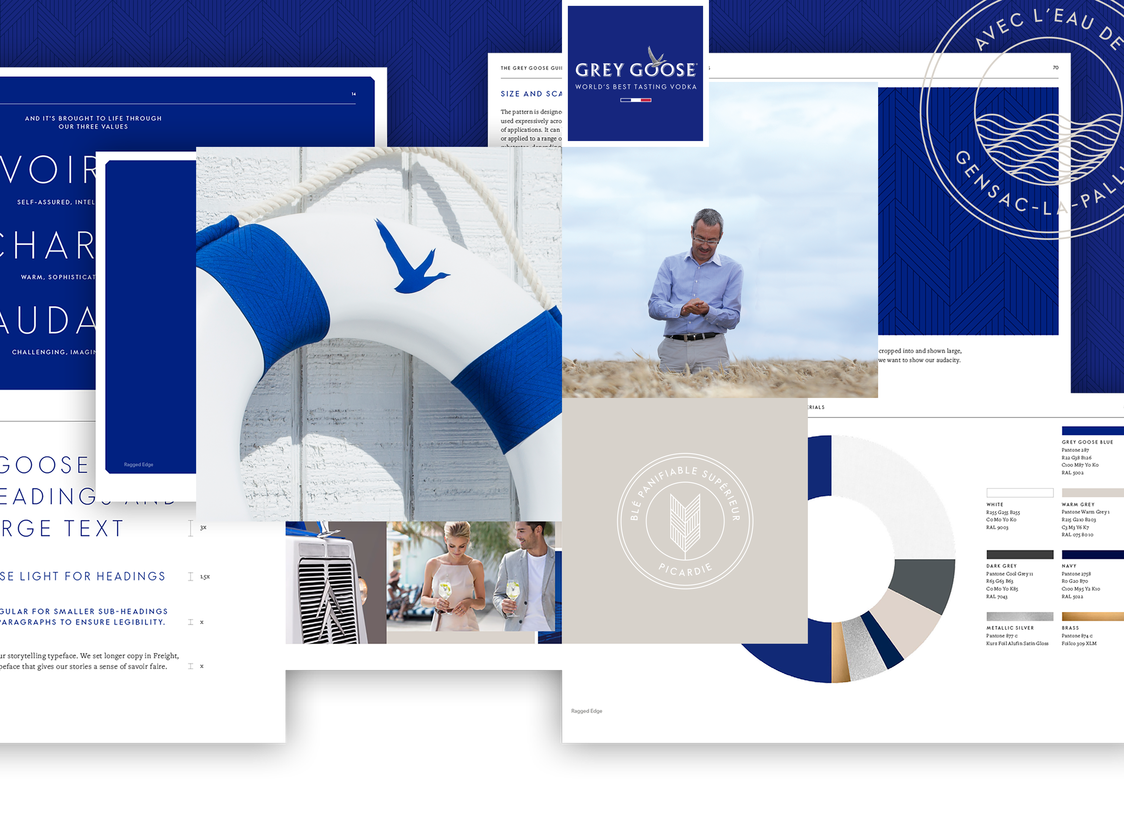
LOOK AND FEEL —
Applying the brand
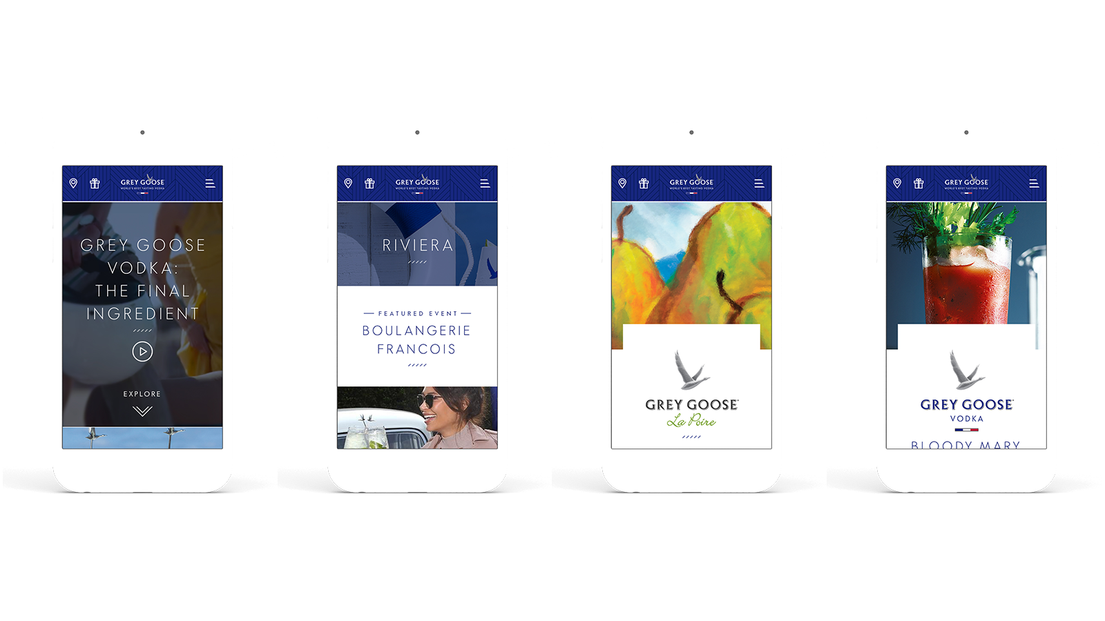
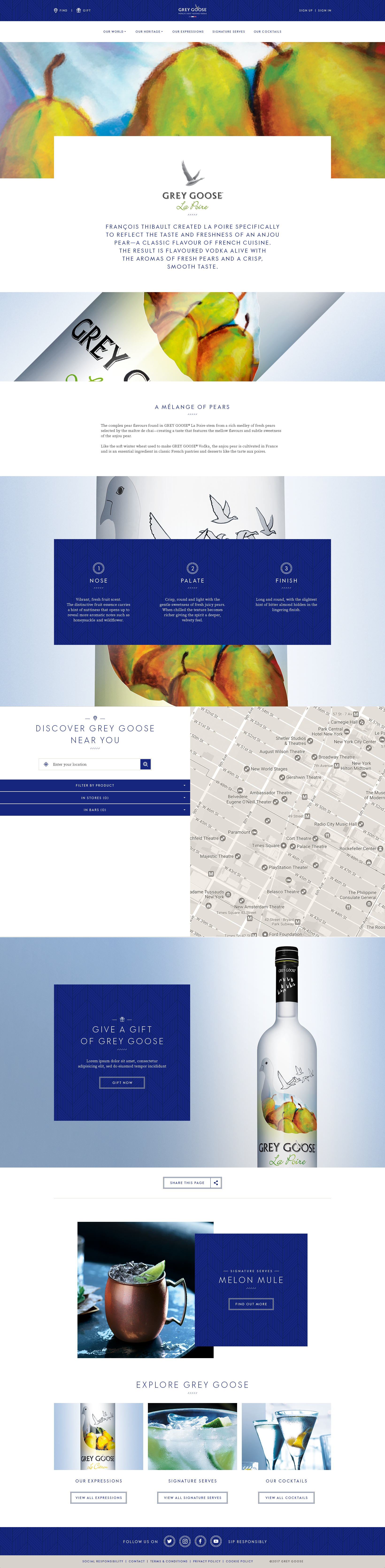
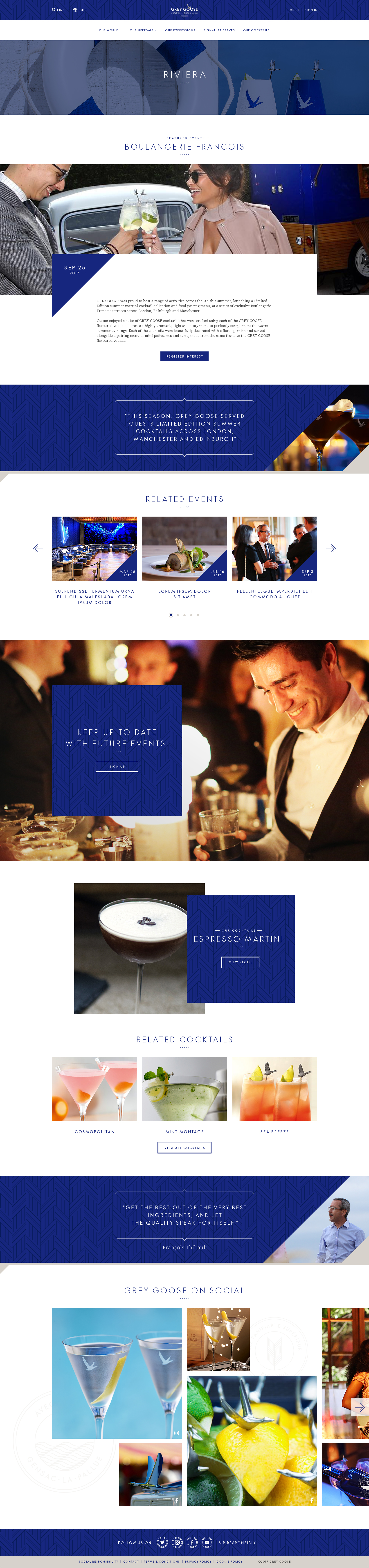
Examining the BVI helped introduce brand elements such as the brand pattern and other assets we could utilise in creating a more premium website. As a key part of the Grey Goose brand, I explored ways to emphasise the brand pattern. The angle taken from the pattern was continued into other elements across the site, such as heading underlines and image crops.
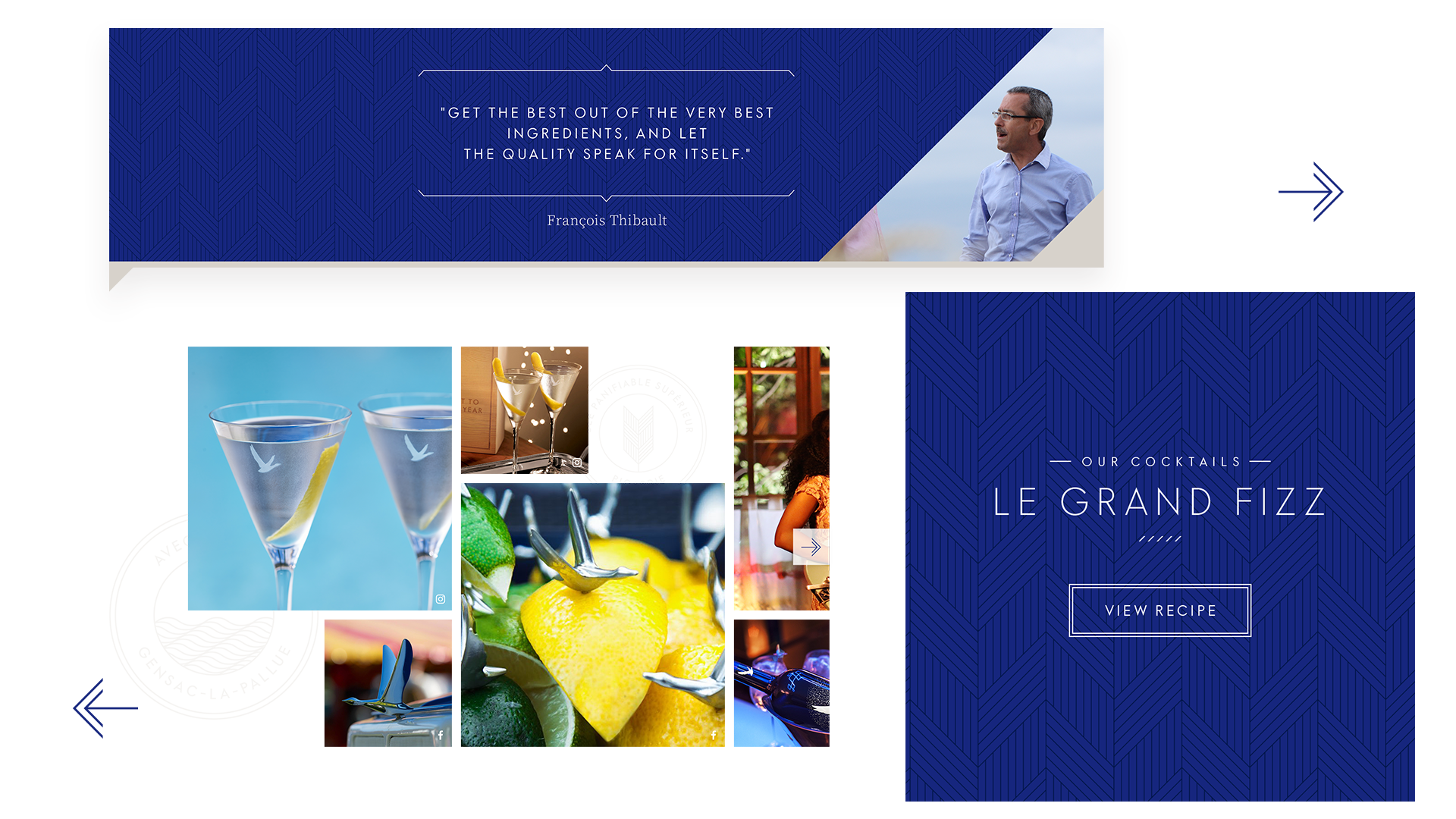
All in the detail
Quotation module — adds a human element and allows for more blue to be introduced into the design. It also acts as a dividing element in which Grey Goose branding and heritage can be highlighted.
Social feed — a less structured grid adds to the dynamic feel and allows for larger images to be highlighted. Storytelling roundels introduce more heritage elements on the page.
Overlaps — used to help break away from the structured design.
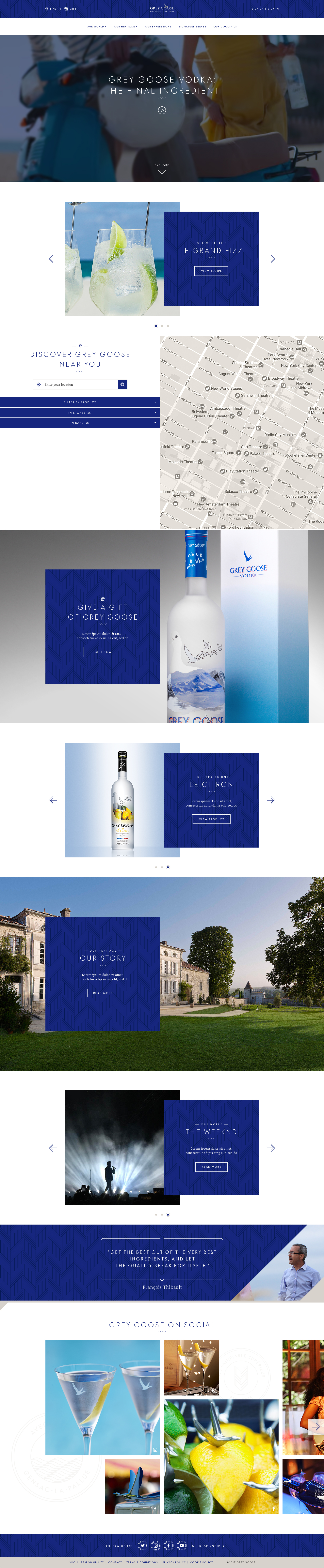
Homepage—
Individual Product—
Initial approach
Initial design routes were based on wireframes and UX documentation supplied by an external agency. Further discussions and exploration resulted in a rethink of the design — inpage navigations were removed, simplifying the overall experience and adding to the clean aesthetic set out by the look and feel.
Individual Campaign—
Additional features for future phases included the ability to add drink recipe ingredients straight to your shopping basket.