MAURÍCIO'S
CLIENT
Maurício's
SERVICES
Brand Identity
YEAR
2022
Brand identity for a small pizza company.
Maurício's is a newly established plant-based pizza maker.
I was approached to design their logo to help kick-start the launch of the business. This was ultimately expanded to include additional brand elements such as the colour palette, typography and brand application explorations.
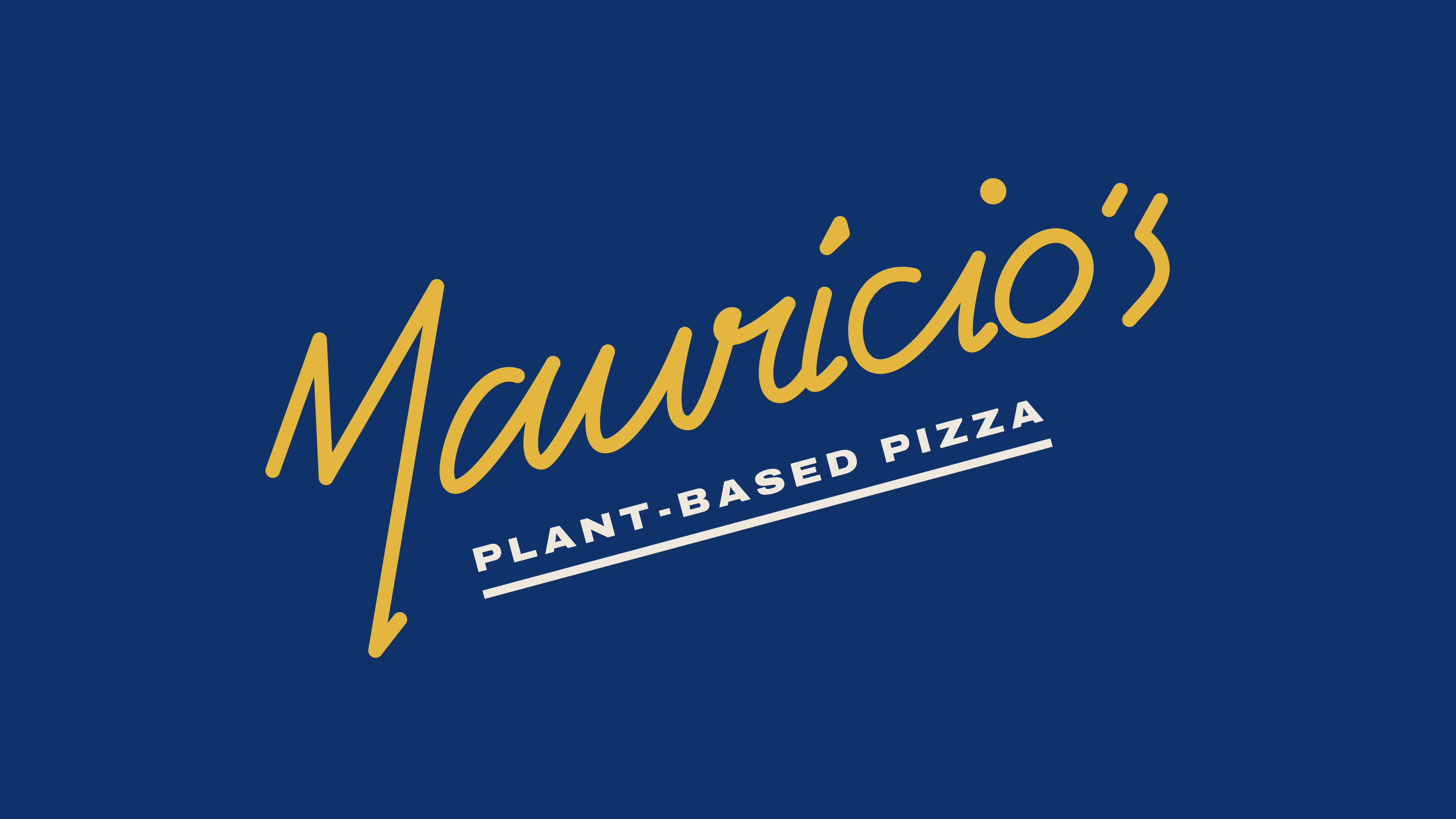
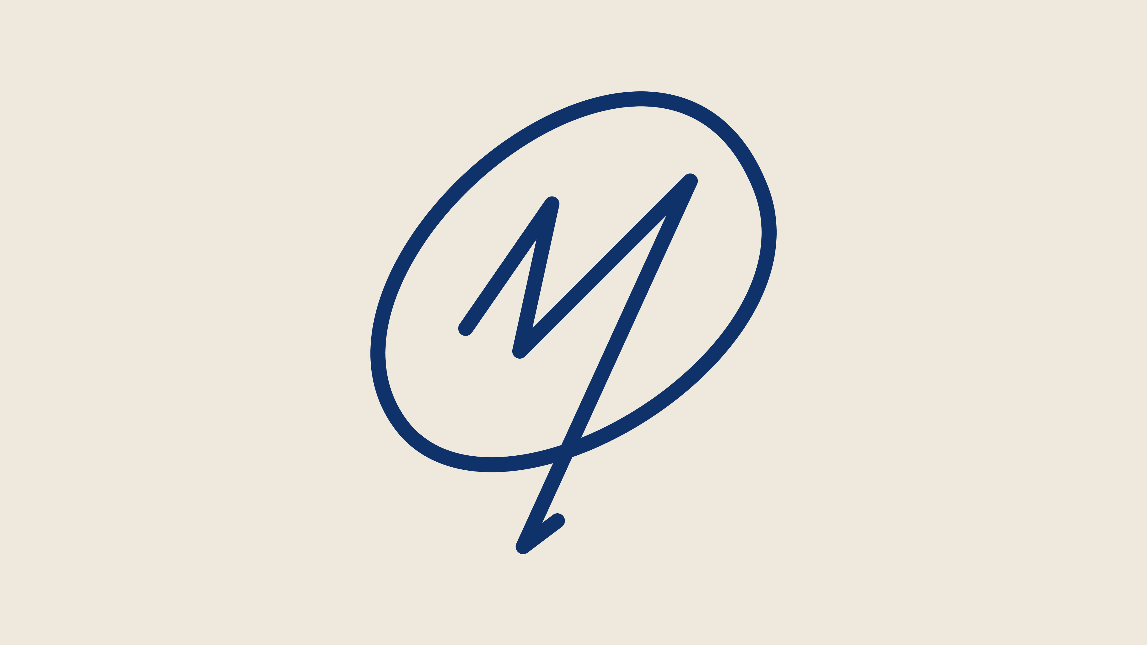
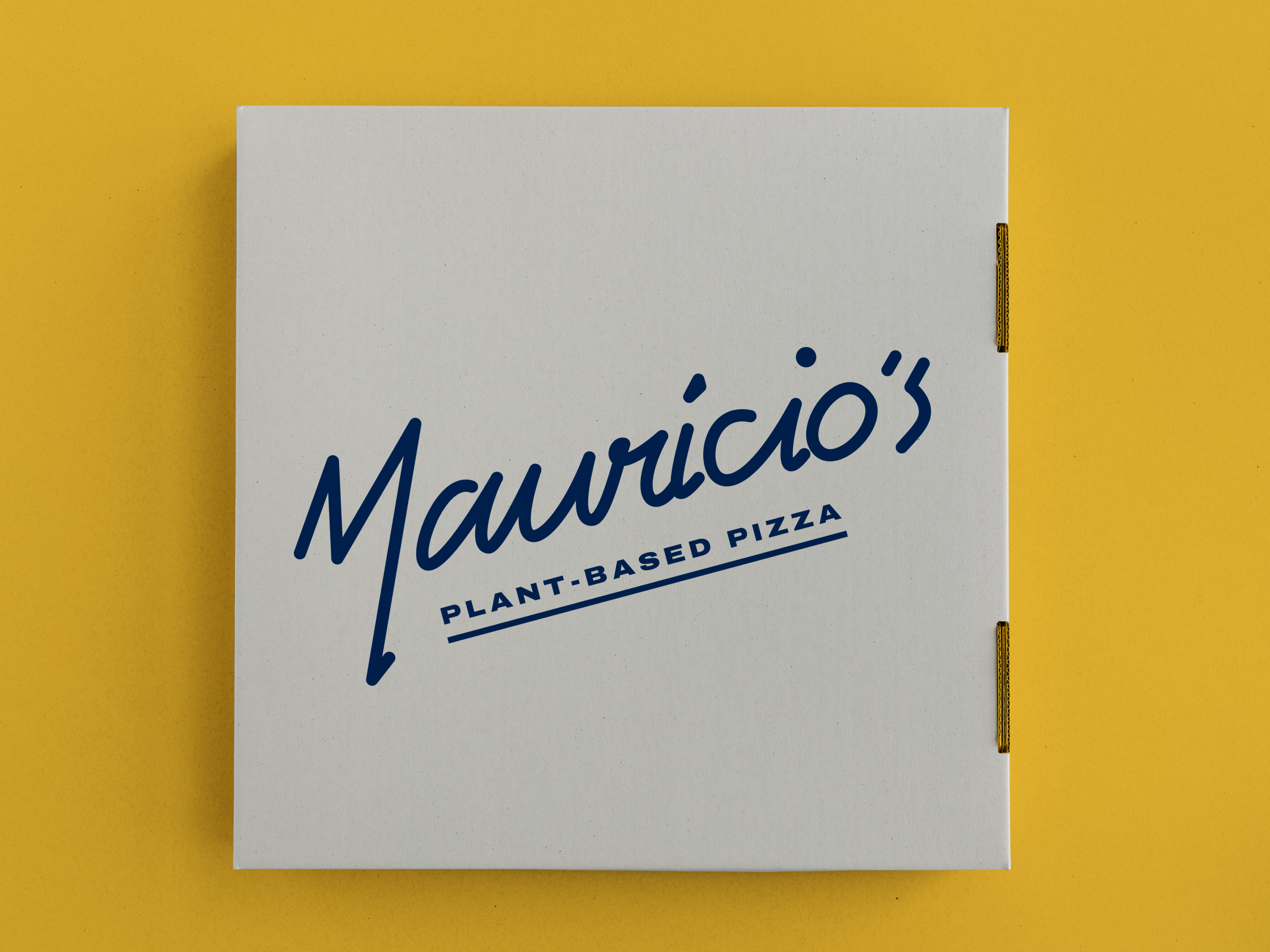
Logotype & symbol
The logotype is based on the signature of its namesake (the founder’s grandfather), bringing with it authenticity and a modern twist. The acute accent above the first 'i' and the dot above the second hint towards the food offering (calzone + pizza), and are used in other aspects of the visual language.
Maurício's symbol is simple, emphasising the somewhat unique flick of the 'M'.
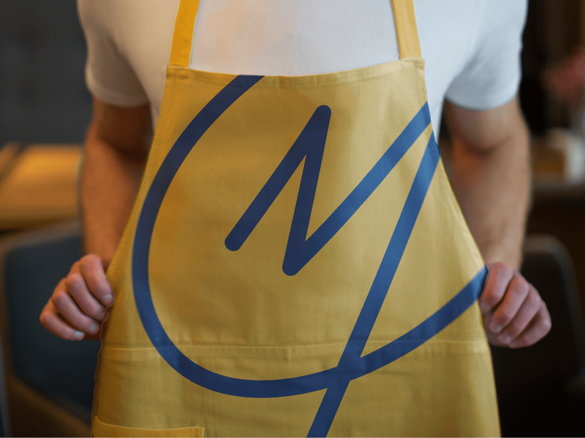
Maurício's visual language comes from a desire to avoid clichés—from steering clear of a red-green colour palette, to the exclusion of symbols such as herbs.
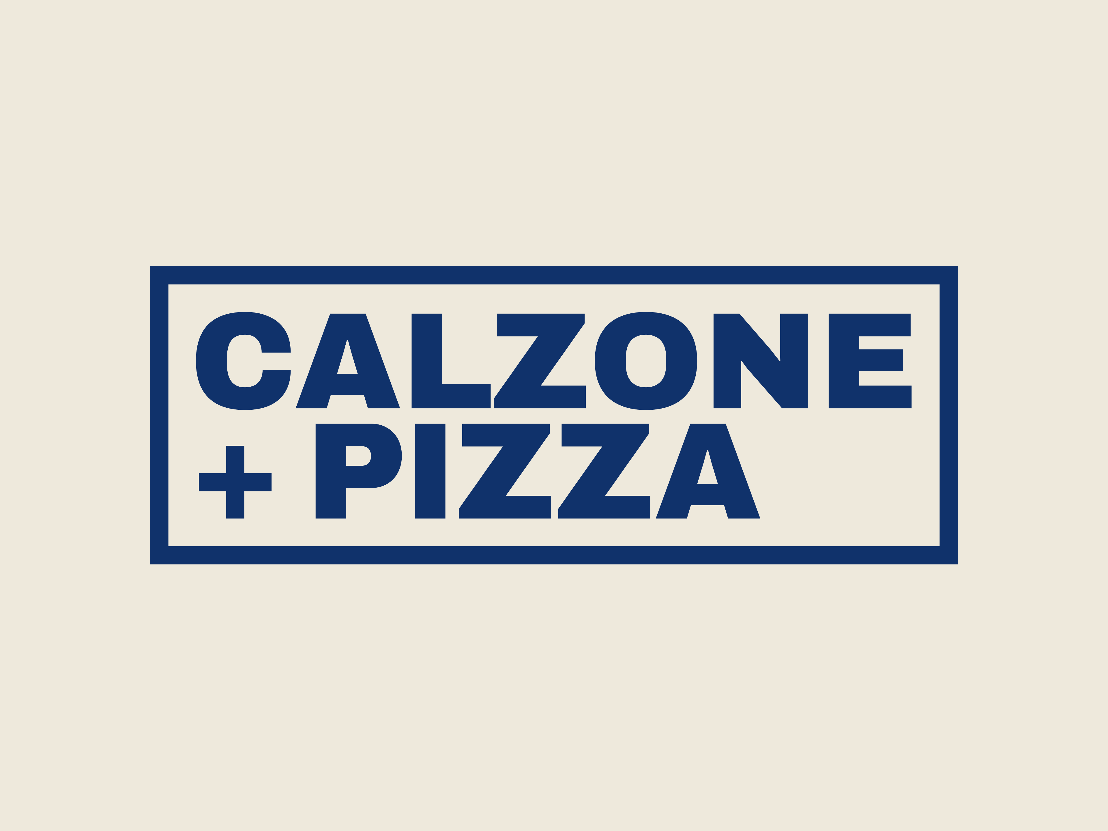
Stamp / tagline

Brand pattern
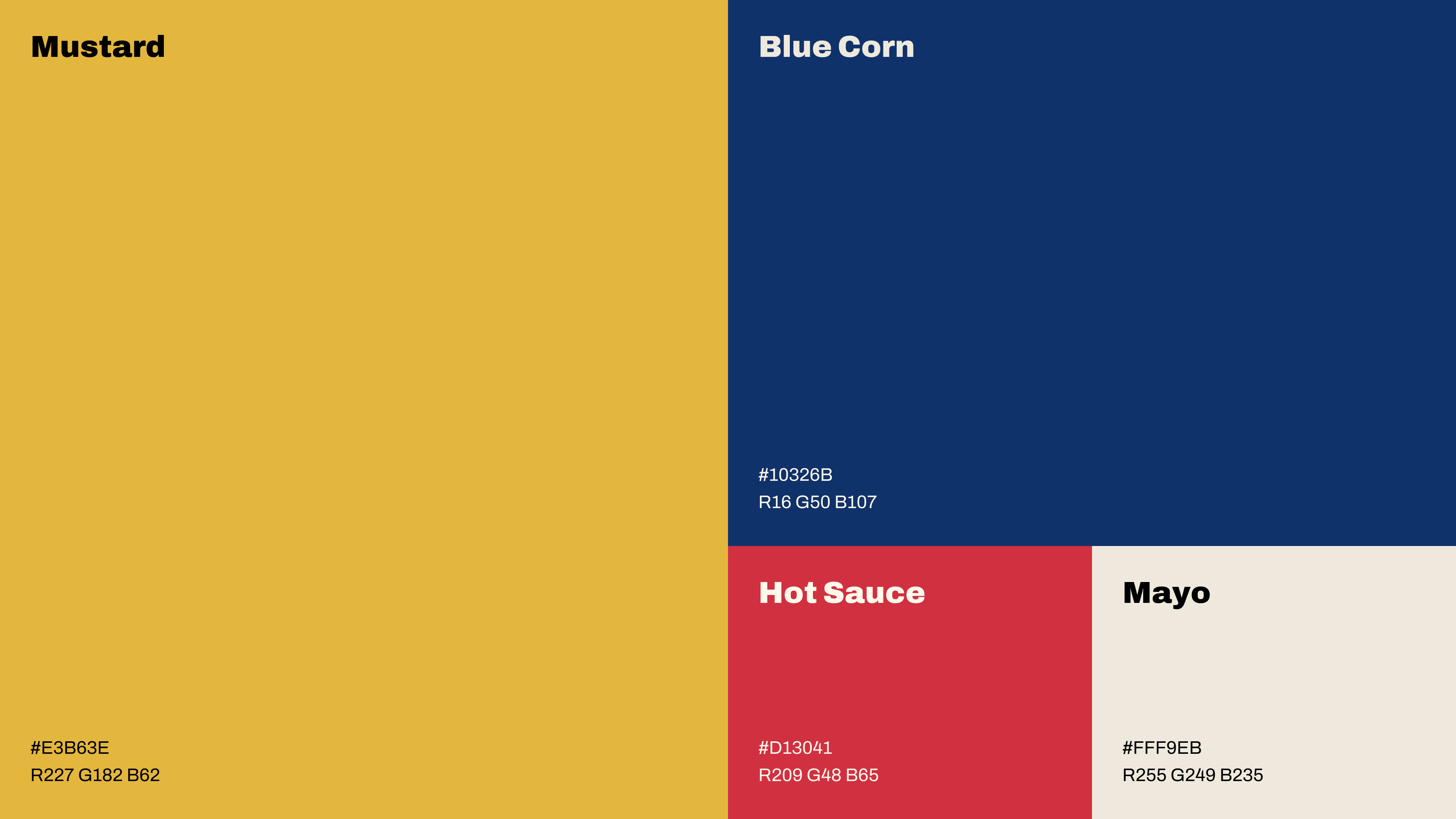
Colour palette
The colour palette is centred around simplicity. The palette is set in warm, yet slightly desaturated tones to soften the look and provide a friendly, authentic feel.
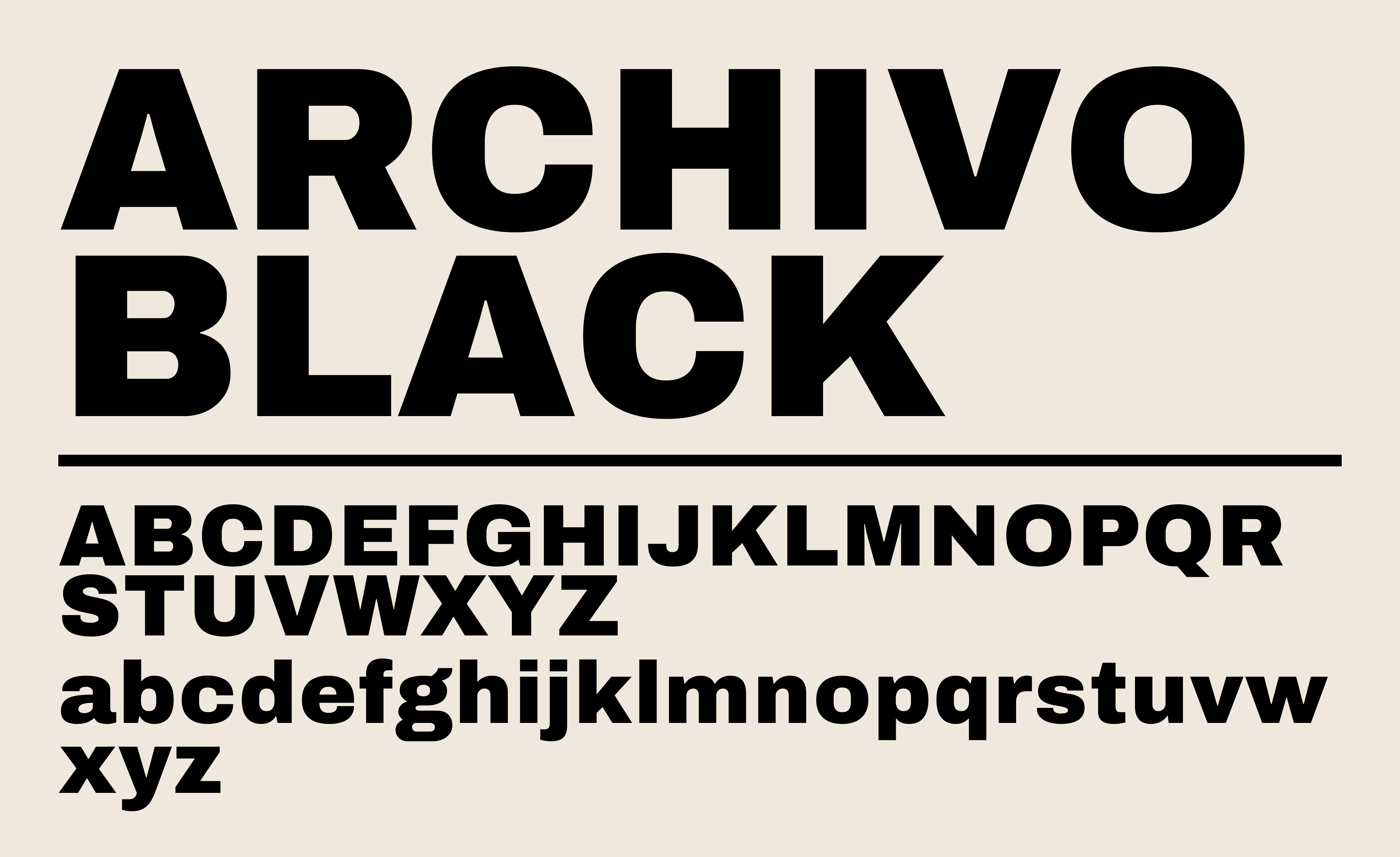
Typography
To add more personality, I opted for a contrasting typeface, deciding on Archivo—namely Archivo Black. It’s simple, yet bold, with its chunkiness being in complete contrast to the signature logotype.